Mudar Cores na Imagem Sem Estragar o Sombreamento
Aprenda a mudar cores em elementos da imagem mantendo sombras, textura e detalhes, com métodos, passos e uma verificação para daltônicos.
Este artigo ainda não foi traduzido, por isso aparece em inglês.
Somebody hands you a photo and a small request: the jacket, but in olive. You open the file, add a Hue/Saturation layer, drag the hue slider, and the jacket does turn olive. So does the model's left cheek, the wooden door behind her, and the shadow under the collar. You undo, mask it properly, drag again, and now the jacket looks like it was cut out with scissors and pasted back at the wrong brightness.
That second failure is the one that gets work sent back. The color matched. The light didn't.
Recoloring is rarely a color problem. It's a lighting problem wearing a color costume, which is why the slider that fixes the hue can wreck the shading in the same drag. The method that works is the lightest one that keeps the light, followed by a numeric check that the shadows and highlights survived, followed by a look at the file through color-vision simulation before it ships.
Table of Contents
- Choose the Right Recolor Method for Your Image
- How to Recolor One Object Step by Step
- Recoloring with AI Prompts Without Losing Control
- Recoloring for Color-Blind Viewers Without Losing Meaning
- Check Shading and Export Before You Ship
Choose the Right Recolor Method for Your Image
The request usually lands on a deadline. A product shot needs a second colorway for a landing page, or a stock photo has the wrong shirt for a brand palette. The instinct is to reach for Hue/Saturation immediately. The better first move is to pick the method, because the method decides whether the folds, the specular highlights, and the material read survive the edit.
Six approaches cover almost everything you'll meet, and they differ far more in risk than in speed.
| Method | Best for | Keeps shading | Main risk |
|---|---|---|---|
| Global hue or saturation shift | Whole-image tint or mood change | Partly | Changes every pixel of that hue, including skin and sky |
| Masked hue shift on one object | Product color swap, clothing | Yes, when lightness is preserved | Visible edge halos where the mask is loose |
| Color blend mode over a selection | Matte surfaces that must keep folds and light | Yes | Flat look on very dark or very bright areas |
| Replace Color selection tool | Solid, flat-colored objects | Limited | Fails on gradients and textured surfaces |
| AI prompt-based recolor | Quick concept variants in complex scenes | Needs review every time | Can change texture, shape or brand color without warning |
| Template color swap in a design app | Logos, icons, flat graphics | Not needed | Does not work on photographs |
Read the table from the middle column outward. Speed is rarely what limits you. What limits you is whether the surface still looks lit by the same lamp as everything around it, and the rightmost column is where each method breaks that illusion. Edge halos mean the mask, not the hue, needs the next ten minutes. A flat look means the blend mode stripped the shadows, so the fix is a lightness check, not a different color.
That's why AI prompt-based recoloring sits near the bottom for production work. It earns its place on hair, mesh, and other edges that are miserable to mask, and it's the fastest route to concept variants. But it regenerates pixels rather than shifting them, so it can change the weave of a fabric, thin a strap, or drift a brand color a few degrees off spec. Every output needs a 100 percent zoom review against the original before it goes anywhere near a client.
Template swaps belong in a different universe. Clicking a graphic in Canva and recoloring it through the color squares in the toolbar is exactly right for icons, line art, and flat illustrations, and exactly wrong for a photograph, because there are no separate shapes to recolor.
The working rule: use the lightest method that preserves the shading the image depends on, and move up the table only when that method visibly fails.
Teams producing variants by the hundred rather than one at a time usually move the masked edit into a pipeline, and the photo editing API guide explains how that handoff works. When the brief is a mood rather than a client swatch, ColorSeason AI on AI Tool Seekers generates coordinated target colors, which beats sampling a hex off a screenshot and finding out it fights the scene's light.
How to Recolor One Object Step by Step
Start with the target color, not the layer stack. Sample a hex value from a reference swatch, then compare its lightness to the object's current lightness. If the swatch is much darker or much lighter than the shirt you're changing, you'll be adding a brightness shift on top of a hue shift, and that's where the pasted-on look comes from. Match the lightness first, then move only the hue. Photopea and GIMP handle the same sequence with a Hue/Saturation layer and a clipping mask, so nothing here depends on a subscription.
Here's the workflow in order, with the failure each step is designed to prevent.
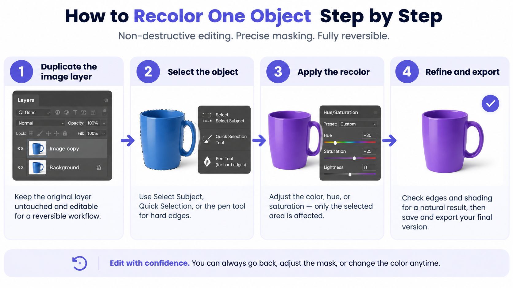
Duplicate the image layer. One keystroke, and every later step becomes reversible. The common slip is editing the background directly, then having no clean reference when the client asks to see the original rust version beside the new one.
Select the object. Use Select Subject, Quick Selection, or the pen tool for hard manufactured edges like bottles, phones, and boxes. The mask decides where the change stops. Too tight a mask leaves a rim of the original color at the boundary; too loose and the new hue spills onto the wall behind.
Clip a Hue/Saturation adjustment layer to that mask. Alt-click or Option-click the line between the layers, or use the clipping icon. The change now lives inside the selection and stays editable. The slip is a layer that never clipped, so it repaints the whole frame.
Move the hue to the target, then raise saturation, in that order. Stop increasing saturation the moment the color matches the swatch. Pushing past that point flattens shadow detail and gives the surface a plastic sheen that no amount of masking repairs.
Set the adjustment layer's blend mode to Color. Color takes hue and saturation from the layer and leaves luminosity from the image, so highlights and shadows show through. The slip is leaving it on Normal, which paints a flat coat over every fold.
Feather the mask by about half a pixel to one pixel. Camera edges are soft, and a razor-sharp mask reads as a cutout at full zoom. Feathering five pixels to "smooth things out" smears the new color into the background and creates the halo every reviewer spots instantly.
Toggle the layer and compare. Check texture, specular highlights, and whether the object still reads as the same material. Judge at 100 percent, not fit-to-screen, because edge artifacts and lost grain show up at full resolution and vanish in a thumbnail.
If the object looks lit by a different lamp than the rest of the scene, its lightness moved, and the fix is back at step 5 rather than another nudge of the hue slider.
When the mask itself is the bottleneck, generating a clean alpha channel programmatically saves the tedious pass; the remove background API guide covers that route. Either way, the rule holds: mask precisely, shift hue, keep luminosity, then look at the edges at full size before you show anyone.
Recoloring with AI Prompts Without Losing Control
A charcoal jacket in a street photo needs to become olive. Ask for a nicer jacket and you'll get a garment that has been redrawn: buttons move, the collar changes shape, and the backlight that was falling across the shoulder is gone. Ask for an olive jacket with the same folds, the same backlight, the same pose and the same background, and the model has something narrow enough to obey.
That contrast is the whole craft of prompt-based recoloring. Vague prompts get you a new picture. Structured prompts get you the same picture with a different color.
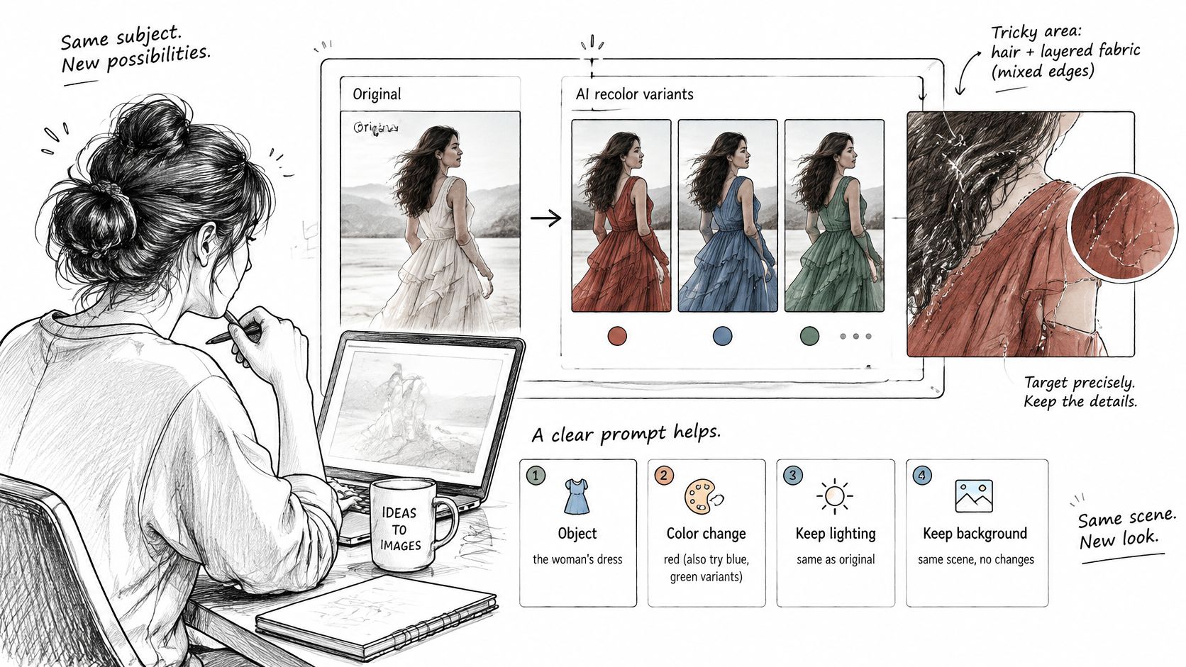
Build every prompt from four parts:
- The object, named precisely and located in the frame ("the denim jacket the subject is wearing").
- The target color, named as a specific tone rather than a mood ("deep olive green, roughly #556B2F"). Hex values aren't guaranteed, but they narrow the result.
- What must not change: lighting direction, material texture, background, pose, shape, crop. Say all of it, every time.
- The output format, such as same aspect ratio, full resolution, no added elements.
What to check before you accept the output
Open the original and the result side by side at 100 percent zoom. Confirm the edges sit naturally against the background, the grain and texture survive, and the silhouette hasn't shifted. Reject anything that adds detail, removes a fold, or moves a logo. Reject a brand color that's drifted, because a close-enough orange is a brand problem, not a design choice.
There's a deeper reason to compare against the original rather than trust the result. In 2025, researchers from the University of Louisville and collaborators analyzed 8,400 images to compare color statistics in images generated by three AI models, DALL·E 2, DreamStudio, and Adobe Firefly, with real images from Bing Image Search, as reported in the Journal of the Optical Society of America A. Generated images carry different color statistics from photographs, so an AI-recolored object can look plausible in isolation and slightly wrong beside the rest of the frame. Iteration is cheap enough to reject freely: Flux 2 Pro runs $0.0075 per image through UberLLM against a $0.03 list price, so throwing out three variants to keep the fourth costs less than the time you'd spend retouching a bad one.
Recoloring for Color-Blind Viewers Without Losing Meaning
Most guides about how to change colors in image files treat the job as cosmetic: swap the shirt, match the logo, tint the background. The more consequential question is whether the recolored image still communicates to everyone who looks at it. Color-vision deficiency affects approximately 8% of males and 0.5% of females, according to a 2024 ACM study on semantic recoloring, which means a chart, a status indicator, or a product colorway that reads clearly to you can merge two meaningful signals for a meaningful slice of your audience.
The counterintuitive part is that more color isn't more accessible. A global saturation boost or a whole-image hue shift can invent new confusions in regions that were never a problem, and whole-image filters alter colors nobody complained about. The same research recommends object-aware recoloring, preservation of luminance and contrast, and validation through simulation, and it notes that contrast calculation specifically for color-vision-deficient users still gets too little attention. Semantic recoloring of artwork follows the selective logic: change the regions that are confusing and leave the rest of the image alone.
Simulate the three conditions, not one
| Condition | Colors it confuses | Approximate prevalence | What to check |
|---|---|---|---|
| Protanopia (missing red-sensitive cones) | Red and green, reds look dark | About 1% of males | Red and green elements differ in lightness |
| Deuteranopia (missing green-sensitive cones) | Red and green, greens look like browns | About 5 to 6% of males | Greens and browns or reds remain distinct |
| Tritanopia (missing blue-sensitive cones) | Blue and yellow, purple and red | Rare in both sexes | Blue and green or purple and red stay separable |
Run the recolored file through a simulator for all three and look specifically at the regions you changed. A single deuteranopia preview isn't enough, because an edit that fixes a red-green pair can collapse a blue-yellow one you never noticed. Say a dashboard uses a red dot for failed jobs and a green dot for passed ones. Recolor just those two elements to blue and orange, keep every other panel untouched, and the meaning survives for color-blind viewers without redesigning the rest of the interface.
If two recolored elements look identical in any simulation, fix it with lightness rather than another hue. Brightness differences survive every form of color-vision deficiency; hue differences don't.
Check Shading and Export Before You Ship
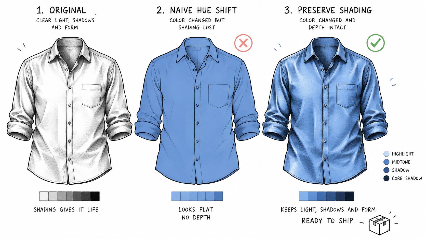
A hue change on its own doesn't carry light. The folds in a shirt are dark because they receive less light, so any shift that also moves lightness either flattens those folds into a solid patch or makes them glow. Whatever produced the recolor, it has to preserve the same things: shadows, highlights, material appearance, reflections, transparency, and the boundary between object and background. Lose any of them and a product reads as a different material under inconsistent lighting, which is a commercial problem as much as a visual one.
Two failure modes come up often enough in production to plan around. The first is boundaries: object edges and lighting variation stay hard problems even for segmentation-guided recoloring, so the mask still matters more than the model. The second is color space. An editor may adjust colors in HSI or another intermediate space, and the result has to be converted back to RGB before export so displays interpret it correctly. Export from a working space that was never RGB-converted and the file can look right on your monitor and wrong in the browser.
The lightness check that catches a failed recolor
Before you trust any recolor, sample numbers. Set the Info panel to HSB or Lab, then read the darkest shadow and the brightest highlight on the object, before and after. The lightness readings should stay close while only the hue moves. If the shadow reading climbed, you've lifted the blacks and the object will look lit from inside. If the highlight dropped, you've killed the specular and the surface will look like felt. When either happens, reduce the saturation change first, then switch to a blend mode that carries luminosity, and only then consider rebuilding the mask.
Four checks before you export
- Mask edge at 100 percent. Look for halos, a residual rim of original color, and spilled hue on the background.
- Shadow and highlight agreement. Confirm the changed object's darkest and brightest values sit in the same range as neighbouring objects under the same light.
- Two displays. View the exported RGB file on a laptop panel and a phone. A match on one screen routinely shifts on the other, especially in saturated reds and greens.
- Simulation re-run. Push the file back through the protanopia, deuteranopia, and tritanopia previews and confirm the key elements are still separable.
If the scene's light and the object's grade need to agree more broadly, the color grading advice from Nim covers matching tone across a whole frame, which is the same problem at larger scale.
One production detail worth planning for: if you generate the recolor through an API rather than a desktop editor, image links are kept for about 15 minutes, so download and archive the file immediately instead of pointing a CMS at the URL. Result files for video and music jobs last about 3 hours. Keep the mask and adjustment layers alongside the exported file, and the next colorway request takes minutes instead of a rebuild.
If the recolor passes all four checks, export and archive. If it fails, go back to the method table in the first section and step to the next lighter method rather than adding more saturation to compensate.
UberLLM gives developers and media teams a single API for image generation and editing, behind one key and one prepaid balance. Media jobs return a task you can poll, or you can set a webhook to notify your app when the result is ready, and failed generations aren't charged, so testing a recolor prompt across models costs only the results you keep. Compare outputs in the dashboard playground before committing to a pipeline, then visit UberLLM to see the model list, pricing, and integration guides and run your first edit against your own reference image.